-As most of you know, color is light and energy. Color is visible because it reflects, bends, and refracts through all kinds of particles, molecules and objects. There are a variety of wavelengths that light can be categorized, producing different types of light. Visible wavelengths fall approximately in the 390 to 750 nanometre range and is known as the visible spectrum. Other wavelengths and frequencies are associated with non-visible light such as x-rays & ultraviolet rays. Most people are aware of the effects of non-visible light, so it makes sense that visible light would also affect us.
Colour History.
Earliest Times of Colour -The ancient Egyptians have been recorded to have been using colour for cures and ailments.They worshipped the sun, knowing that without light there can be no life. They looked at nature and copied it in many aspects of their lives. The floors of their temples were often green - as the grass which then grew alongside their river, the Nile. Blue was a very important colour to the Egyptians too; the colour of the sky. They built temples for healing and used gems (crystals) through which the sunlight shone. They would have different rooms for different colours. We could perhaps relate our present methods of colour/light therapy to this ancient practice.There are lists on papyrus dating back to 1550 BC of colour "cures". Their deep knowledge and understanding of the healing powers of the colour rays was so nearly lost when, later on in history, the Greeks considered colour only as a science. Hippocrates, amongst others, abandoned the metaphysical side of colour, concentrating only on the scientific aspect. Fortunately, despite this, the knowledge and philosophy of colour was handed down through the ages by a few.The Chinese also apparently practiced Colour Healing. The Nei/ching, 2000 years old, records colour diagnoses.
 | ||||
| Ancient Egyptians used colour for therapy. |
Issac Newton (1642 - 1727)-A pioneer in the field of colour, Isaac Newton in 1672, published his first, controversial paper on colour, and forty years later, his work 'Opticks'.Newton passed a beam of sunlight through a prism. When the light came out of the prism is was not white but was of seven different colours: Red, Orange, Yellow, Green, Blue, Indigo and Violet. The spreading into rays was called dispersion by Newton and he called the different coloured rays the spectrum.He learnt that when the light rays were passed again through a prism the rays turned back into white light. If only one ray was passed through the prism it would come out the same colour as it went in. Newton concluded that white light was made up of seven different coloured rays.
 |
| Issac Newton a pioneer of colour. |
Colour Therapy
Color therapy, also known as chromotherapy, is often facilitated in the healing rooms of alternative health practitioners. Color therapy is classified as a vibrational healing modality. Vibrational medicine incorporates the use of chi energies within living organisms such as plants, gemstones and crystals, water, sunlight, and sound.Color is simply a form of visible light, of electromagnetic energy. All the primary colors reflected in the rainbow carry their own unique healing properties. The sun alone is a wonderful healer! Just imagine what life would be like without sunshine. It has been proven that lack of sunlight contributes to depression for some people.
( Colour Properties )1. Colour Wheel
-Is a color circle and a basic tool for combining colors. The most common version is a wheel of 12 colors based on the RYB (or artistic) color model.These are called color harmonies or color chords and they consist of two or more colors with a fixed relation in the color wheel.

Primary Colour

Secondary Colour
-The three secondary colors (green, orange and purple) are
created by mixing two primary colors.

- Six tertiary colors are created by mixing primary and secondary colors.

--
- Analogous

- Complementary

- Split complementary

- Triad

- Tetrad

The Examples of Colour Harmonious :


--
( Monochromatic & Achromatic colours )
-Monochromatic color schemes are derived from a single base hue and extended using its shades, tones and tints. Tints are achieved by adding white and shades and tones are achieved by adding a darker color, gray or black.

-Achromatic colours
-Achromatic is an adjective that means “free of color.” In printing, achromatic is used as a synonym for “black and white.” A black and white print has shades of grey, but greyscale is also considered to be achromatic because it lacks hue, which means it cannot be classified as a subset of the colors red, green, blue (RGB) or yellow.
* Monochromatic & Achromatic colours final work
 | ||
| Low Poly. |
--
( Colour temperature )
Warm & Cool colours-The color circle can be divided into warm and cool colors.
Warm colors are vivid and energetic.
Cold colors give an impression of calm, and create a soothing impression.
 | ||
| Colour Wheel of WARM and COLD Colours. |
Final work for warm character and cool character:

 |
| Warm And Cold. |
--
( Colour psychology )
The psychology of color is based on the mental and emotional effects
colors have on sighted people in all facets of life. There are some very
subjective pieces to color psychology as well as some more accepted and
proven elements. Keep in mind, that there will also be variations in
interpretation, meaning, and perception between different cultures.Marketing and advertising are well-known for utilizing color
psychology. The fact that some companies have heavily invested in this
type of research and many others have followed through in its use shows
they have at enough belief in the concepts of color psychology to
implement them in their advertising.Color is consistently used in an attempt to make people hungry,
associate a positive or negative tone, encourage trust, feelings of
calmness or energy, and countless other ways.Most marketing and advertising executives will likely agree that
there are benefits to understanding and utilizing the psychological
effects of colors. Now let’s take a look at some of the more common
traits of color psychology, by some common colors.
 Link:Colour Psychology

 link:Therapy
 link: Symbolism


Link:Marketing
-Colour psychology as therapy
Color therapy and healing (also known as chromotherapy or light
therapy) is a type of holistic healing that uses the visible spectrum of
light and color to affect a person’s mood and physical or mental
health. Each color falls into a specific frequency and vibration, which
many believe contribute to specific properties that can be used to
affect the energy and frequencies within our bodies.While it is common knowledge that light enters through our eyes, it’s
important to note that light can also enter through our skin. Given the
unique frequencies and vibrations of various colors, people believe
that certain colors entering the body can activate hormones causing
chemical reactions within the body, then influencing emotion and
enabling the body to heal.Colors are known to have an effect on people with brain disorders or
people with emotional troubles. For example, the color blue can have a
calming effect which can then result in lower blood pressure, whereas
the color red might have the opposite effect. Green is another color
that may be used to relax people who are emotionally unbalanced. Yellow,
on the other hand, may be used to help invigorate people who might be
suffering from depression.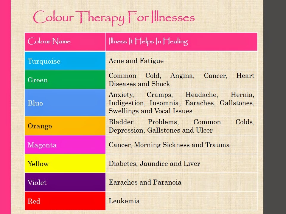
-Colour meaning & symbolism
#symbolism
Color symbolism is the use of color as a representation or meaning of
something that is usually specific to a particular culture or society.
Context, culture and time are certainly important factors to consider
when thinking about color symbolism.
#Meaning
The colors you choose to wear might also say something about how you are
feeling that day. Some days you may fee like wearing something lighter,
something red, or something blue. These choices are often a reflection
of how you are feeling at the moment. Additionally, wearing certain
colors may cause you to react differently to certain situations.
- RED:
Red is the color of fire and blood, so it is associated with energy, war, danger, strength, power, determination as well as passion, desire, and love.
Red is a very emotionally intense color. It enhances human metabolism, increases respiration rate, and raises blood pressure. It has very high visibility, which is why stop signs, stoplights, and fire equipment are usually painted red. In heraldry, red is used to indicate courage. It is a color found in many national flags.
Red brings text and images to the foreground. Use it as an accent color to stimulate people to make quick decisions; it is a perfect color for 'Buy Now' or 'Click Here' buttons on Internet banners and websites. In advertising, red is often used to evoke erotic feelings (red lips, red nails, red-light districts, 'Lady in Red', etc). Red is widely used to indicate danger (high voltage signs, traffic lights). This color is also commonly associated with energy, so you can use it when promoting energy drinks, games, cars, items related to sports and high physical activity.
Light red represents joy, sexuality, passion, sensitivity, and love.
Pink signifies romance, love, and friendship. It denotes feminine qualities and passiveness.
Dark red is associated with vigor, willpower, rage, anger, leadership, courage, longing, malice, and wrath.
Brown suggests stability and denotes masculine qualities.
Reddish-brown is associated with harvest and fall.- Australian Aboriginals: Land, earth
- Celtic: Death, afterlife
- China: Good luck, celebration, summoning
- Cherokees: Success, triumph. Represents the East.
- Hebrew: Sacrifice, sin
- India: Purity
- South Africa: Color of mourning
- Russia: Bolsheviks and Communism
- Eastern: Worn by brides, happiness and prosperity
- Western: Excitement, danger, love, passion, stop, Christmas (with green), Valentine’s Day
- Astrology: Gemini
- Feng Shui: Yang, fire, good luck, money, respect, recognition, vitality
- Psychology: Stimulates brain wave activity, increases heart rate, increases blood pressure
- Roses: Love, respect — red and yellow together means gaiety, joviality
- Stained Glass (Dante): Divine love, the Holy Spirit, courage, self-sacrifice, martyrdom. A warm, active color.
- BLUE:
Blue is the color of the sky and sea. It is often associated with depth and stability. It symbolizes trust, loyalty, wisdom, confidence, intelligence, faith, truth, and heaven.
Blue is considered beneficial to the mind and body. It slows human metabolism and produces a calming effect. Blue is strongly associated with tranquility and calmness. In heraldry, blue is used to symbolize piety and sincerity.
You can use blue to promote products and services related to cleanliness (water purification filters, cleaning liquids, vodka), air and sky (airlines, airports, air conditioners), water and sea (sea voyages, mineral water). As opposed to emotionally warm colors like red, orange, and yellow; blue is linked to consciousness and intellect. Use blue to suggest precision when promoting high-tech products.
Blue is a masculine color; according to studies, it is highly accepted among males. Dark blue is associated with depth, expertise, and stability; it is a preferred color for corporate America.
Avoid using blue when promoting food and cooking, because blue suppresses appetite. When used together with warm colors like yellow or red, blue can create high-impact, vibrant designs; for example, blue-yellow-red is a perfect color scheme for a superhero.
Light blue is associated with health, healing, tranquility, understanding, and softness.
Dark blue represents knowledge, power, integrity, and seriousness.- Cherokees: Defeat, trouble. Represents the North.
- China: Immortality
- Iran: Color of heaven and spirituality, mourning
- Navajo: Tsoodzil — Turquoise Mountain
- Eastern: Wealth, self-cultivation
- Western: Depression, sadness, conservative, corporate, "something blue" bridal tradition
- Astrology: Capricorn and Aquarius (dark blue)
- Feng Shui: Yin, water, calm, love, healing, relaxing, peace, trust, adventure, exploration
- Psychology: Calming, lowers blood pressure, decreases respiration
- Stained Glass (Dante): Wisdom of God, the light of heaven, meditation, enduring loyalty, and eternity.
- WHITE:
White is associated with light, goodness, innocence, purity, and virginity. It is considered to be the color of perfection.
White means safety, purity, and cleanliness. As opposed to black, white usually has a positive connotation. White can represent a successful beginning. In heraldry, white depicts faith and purity.
In advertising, white is associated with coolness and cleanliness because it's the color of snow. You can use white to suggest simplicity in high-tech products. White is an appropriate color for charitable organizations; angels are usually imagined wearing white clothes. White is associated with hospitals, doctors, and sterility, so you can use white to suggest safety when promoting medical products. White is often associated with low weight, low-fat food, and dairy products.
- Apache: North — source of snow.
- Cherokee: Peace and happiness. Represents the South.
- China: Death, mourning
- India: unhappiness
- Japan: White carnation symbolizes death
- Navajo: Tsisnaasjini’ — Dawn or White Shell Mountain
- Eastern: Funerals, helpful people, children, marriage, mourning, peace, travel
- Western: Brides, angels, good guys, hospitals, doctors, peace (white dove)
- Astrology: Aries and Pisces
- Feng Shui: Yang, metal, death, mourning, spirits, ghosts, poise, confidence
- Roses: Reverence, humility
- Stained Glass (Dante): Serenity, peace, purity, joy, faith, and innocence.
- BLACK:
Black is associated with power, elegance, formality, death, evil, and mystery.
Black is a mysterious color associated with fear and the unknown (black holes). It usually has a negative connotation (blacklist, black humor, 'black death'). Black denotes strength and authority; it is considered to be a very formal, elegant, and prestigious color (black tie, black Mercedes). In heraldry, black is the symbol of grief.
Black gives the feeling of perspective and depth, but a black background diminishes readability. A black suit or dress can make you look thinner. When designing for a gallery of art or photography, you can use a black or gray background to make the other colors stand out. Black contrasts well with bright colors. Combined with red or orange – other very powerful colors – black gives a very aggressive color scheme.
- Apache: West — where the sun sets
- Australian Aboriginals: Color of the people
- Cherokee: Problems and death. Represents the West.
- China: Color for young boys
- Navajo: Dibé Nitsaa — Obsidian Mountain
- Thailand: Bad luck, unhappiness, evil
- Eastern: Career, evil, knowledge, mourning, pennance
- Western: Funerals, death, Halloween (with orange), bad guys, rebellion
- Feng Shui: Yin, water, money, income, career success, emotional protection, power, stability, bruises, evil
- Psychology: self-confidence, strength, power
 link: Symbolism
--
Reference:
http://www.tigercolor.com/color-lab/color-theory/color-theory-intro.htm http://www.arttherapyblog.com/online/color-psychology-psychologica-effects-of-colors/#whatis
--
Final Project
-This final project should be a artwork based of my personality and reflect myself.


This is my artwork that reflect my personality. I used red colour to represent myself that I am a warmth person. Sometimes i get tension easily and increased my heartbeat. I used blue colour is because I love peace. I saw someone in calmness, when i in tension. I really get jealous . Blue represented trust . I trust people easily . I choose to trust people rather then distrust others because this is the way to make true friends . I incresemy knowledge of colours after learning of colour study.
--
No comments:
Post a Comment